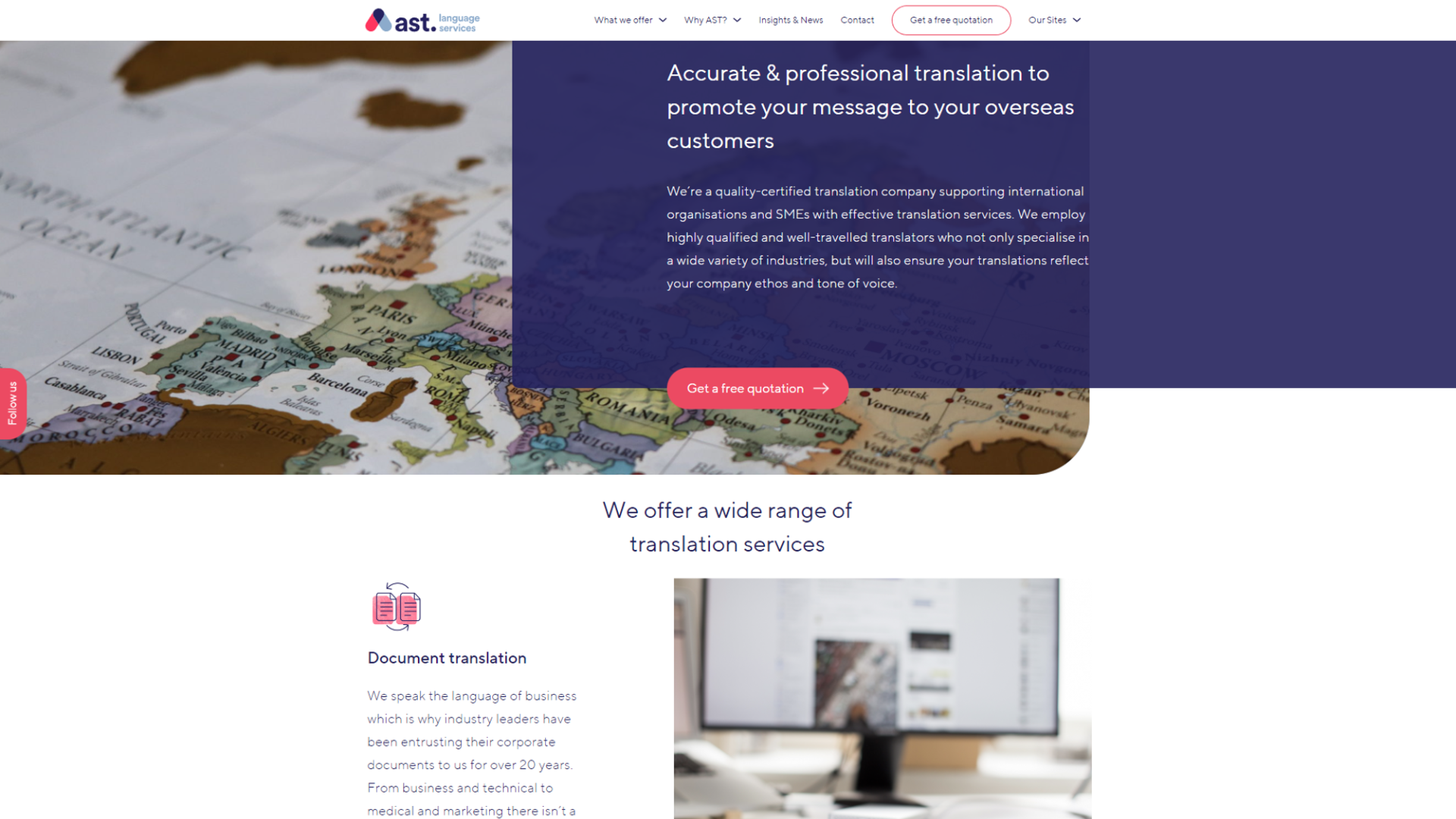
The main reason for the restyle was to show that the brand was evolving and keeping up with the overgrowing field challenges even in the British market that European players would find a bit more challenging to work with due to Brexit.
We researched on the competition, studied ast’s new strategy & values and proposed a more contemporary modern bright palette of 3 main colours: dark blue, bright pink & siel. The combination would balance the more serious side (experience and organisation) with softness and forward-thinking attributes of the business.
One of the main challenges we had to solve was to help potential clients and decision makers in a variety of very different fields to treat a translation project as a fun task that unlocks their business’s potential (translation of marketing-opening into a new market or translation of company guides -transfer of the knowledge to achieve consistency on work processes between markets) rather than a headache.
The brand restyle was the first step that helped the company keep its EU clients and grow even more in the extent to open a new office location in London.
This British B2B Translations Company needed a brand restyle to revamp its look and strengthen its relationship with European clients.
Date : June 2019
Client : Andrew Schlich, AST Language Services
In collaboration with : Framework Agency, Nottingham
Deliverables : Brand Identity, Website
Category : Brand Styling
We were lucky to have Erato turn our son's baptism into a magical woodland forest. The welcome table was like a dream come true LITERALLY!

A new year's dinner night that exceeded my wildest excpectations. Glamour meets Christmas! We felt so unique.